The location is the Azalea Inn and one of the owners has a room called "Karen's Tearoom" where she hosts teas. Azalea Inn has several hats you can wear while experiencing their afternoon tea…or wear your own. I am so excited!


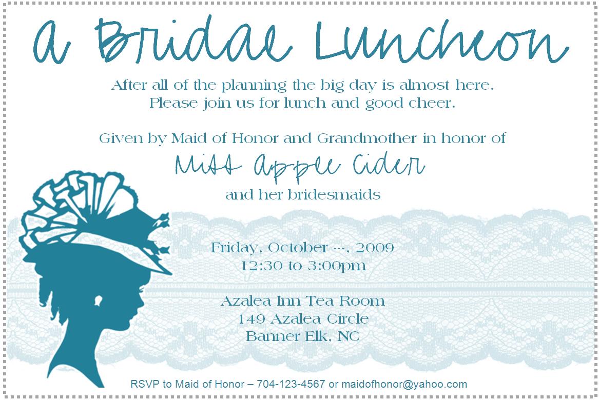
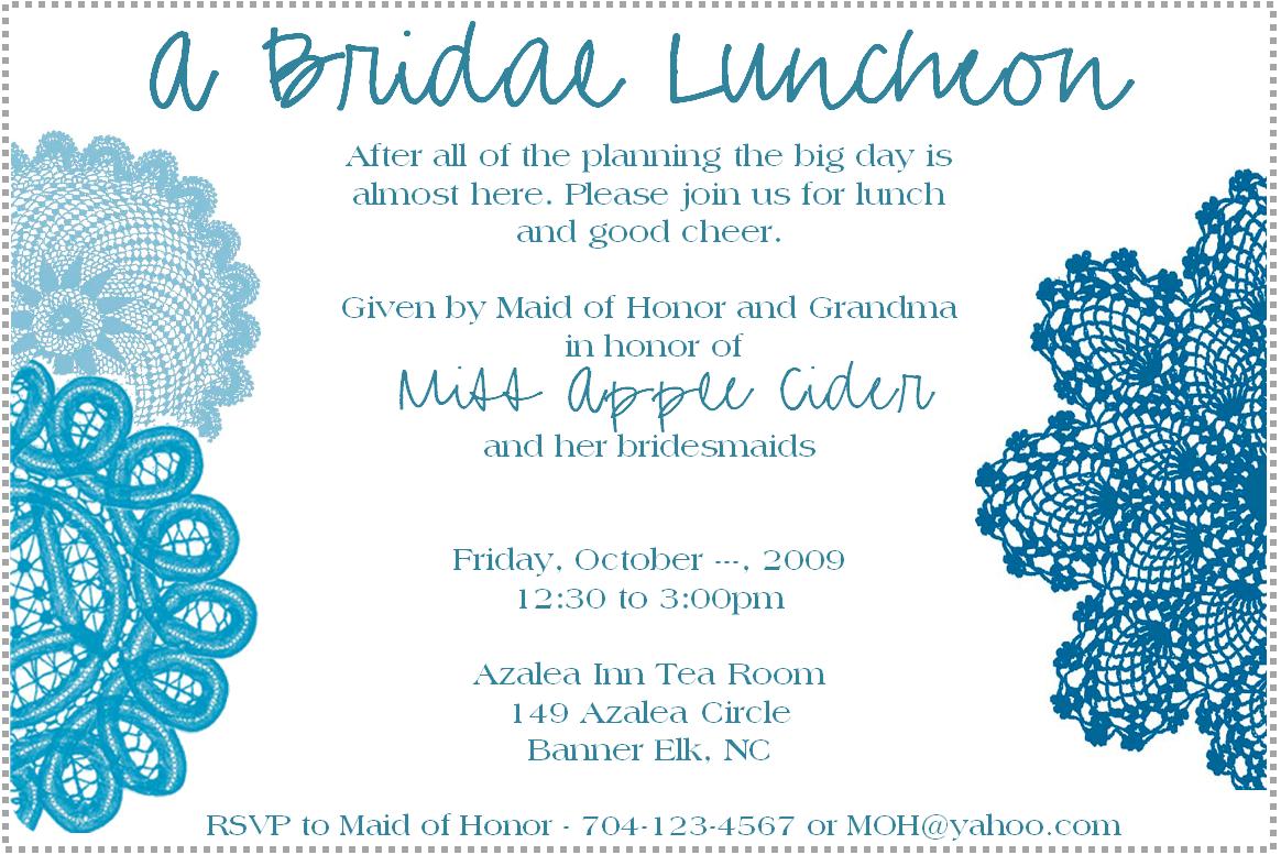
I decided to design the invitation and would love advice from the hive on what invitation you like best. It is so fun making all of these invitations!!!
(CLICK FOR CLOSER LOOKS)
Version 1:

Version 2:

Version 3:

Did you get to participate in designing your shower/luncheon invites? Did you enjoy it as much as me?


+small.jpg)


Dear Carolyn,
ReplyDeleteI just love your blog! I check it everyday to get new great ideas! I like version 3 the best, I think. Have you tried another font called chopin from dafont.com? I used it yesterday on my invitations and it is fab. Anyway, how do you design the graphics for your invitations? They look great! Do you find the image somewhere and just paste it or do you draw it up on photoshop?
Keep up the great work!
xoxo
Amy (Eugenia at yahoo's sister)
so much fun! I love the concept of using the hat silhouette. But my favorite design is the last one...the one with the doilies. Maybe you can use the silhouette on the envelopes or incorporate it some other way? Beautiful job!!
ReplyDeleteGreat job with the blog! Excited to see all the fun deatils... We're really looking forward to shooting your wedding this fall!!
ReplyDelete